See Project
Watchapedia

Home Feed Redesign

Watchapedia

Home Tab
Redesign

Process

Background
Stagnation in User Engagement Metrics
We observed a slowdown in the growth of key actions, like "Add to Watchlist" and "Rate", which were vital metrics for our service.
Users predominantly use Watchapedia to browse and read content metadata and reviews before deciding what content to consume - especially the latest ones.
UX Problems
Frictions in the Browsing Experience
01. Difficulty in Viewing Content by Category
In the Home feed, recommendation cards displayed three categories  - movies, TV shows, and books- in the same feed. Yet, users usually favored only one or two categories. So, users didn't see great value in the Home feed because they only got two or three recommendations in the favored category.
02. Recommendations Failing to Meet the User Needs
Even though users were looking for content available to watch at theaters or their subscribing streaming services at the time, most of the content recommendations were based on the user's ratings regardless of their availability.
03. Difficulty in Finding Trending Content
Trend-related information, crucial for deciding what to watch or read, was hidden inside the category pages and not intuitively discoverable, prompting users to search each piece of content individually.
Goal setting
Envisioning a More Engaging Browsing Interface
My hypothesis was that solving the identified pain points would streamline the flow, broaden the funnel for key actions, and positively impact user engagement.
Refine and optimize the browsing experience, thereby increasing the overall number of user actions.
Strategy & Ideation
Provide Fine-tuned Recommendations
Based on the pattern that most users are looking for something to watch soon, I focused on recommendations aimed at helping them discover accessible content. To achieve this goal, I emphasized available platforms and trending content. Additionally, I diversified the presentation of this information by incorporating other people's reviews or trailers to captivate users' attention.

Following several discussions with the product manager and the engineering team, I honed in on the most impactful content recommendation sections and simplified the structure. This refinement process considered time constraints, feasibility, and our primary objective.
Solution
Focusing on Content Consumption Context and Intuitive Browsing
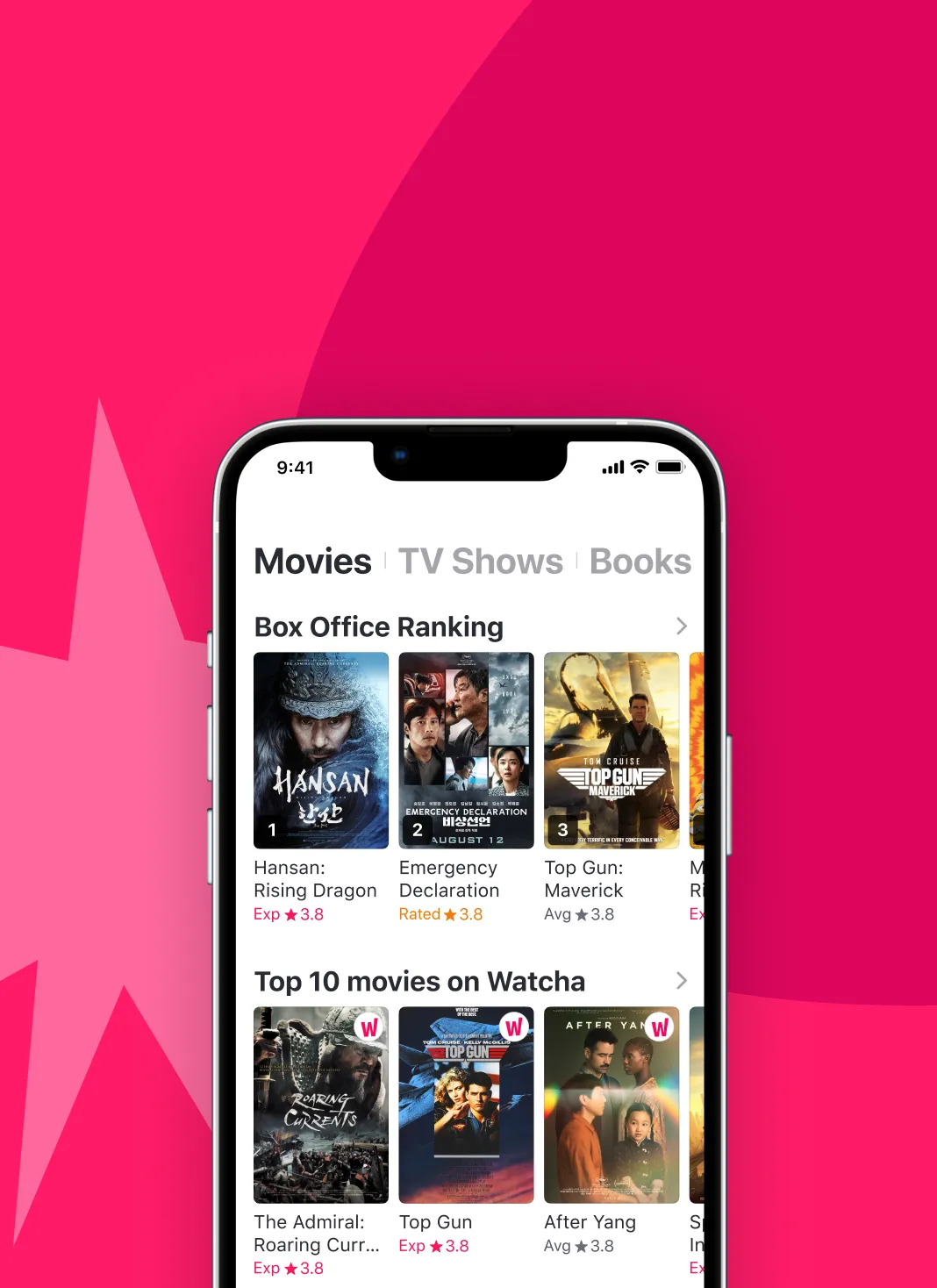
Result
More Content Exploration and an Increase in Key Action
The redesign significantly increased content page visits and related metrics, marking a successful funnel expansion. Total and per-user "Add to Watchlist" actions increased, fulfilling our goal to boost user engagement.
×3.3
Content Page Visits
Initiated from the Homepage
+13%
Per-User
Content Page Visits
+10%
Per-User
"Add to Watchlist" event
Let's work together!
Contact
Let’s connect —
Back to Top
Feel free to reach out for collaborations or just a coffee chat.
Back to Top
Copyright © 2024 Jeonghyun Kim. All rights reserved.